
//01 What is Salud?
Salud is a clothing company based out of Snohomish, Wa. They deliver hip, urban, and modern designs on their clothing that appeals to the younger generations. Giving the youth a sense of belonging and culture, Salud’s mission is to bring communities together and to build a hometown connection wherever people may be.

//02 What is the purpose of rebranding?Salud did not have a defined brand. Aside from what the owner would design and sell via his Instagram page, there were no logos, color palettes, or other assets. The purpose was not as much a rebrand but an initial branding to help Salud define and build according to its target audience.
//03 Target Audience
The projected target audience is mainly tailored to a younger, more urban crowd. The age range should fall somewhere between 18-40 years of age with the prime age group being between 21 and 35. A lot of usability is focused around ease of access for this age group. The quicker they can find things through your design the better, so the Salud site will be designed with simplicity in mind.


//04 Tone and Image
The overall tone of the brand, designs, and site are to be: bold, inviting, warm, and friendly. It is essential that it felt inclusive, hip, and laid back with a splash of edgy fun. No one should think of the brand and feel uncomfortable. This is not a family brand but centers around a feeling of being for everyone. Certain aspects of typography, like the logo, are hand drawn, but the rest of the typography uses sans characters for easy readability. Color tones are mostly muted and stick to grayscale, with vibrant accent colors to provide contrast. The imagery follows a similar pattern in terms of color scheme.
//05 Project Scope
The project included: Branding, mockups, asset building, market studies, card sorting, heuristic evaluations, user testing, redesigns, HTML, CSS, Javascript, and final site-building.
Everything outside of scope pertained to post-launch services including but not limited to: site maintenance, marketing, and post redesigns.
//06 Technology
All asset builds were handled in primarily Adobe Creative Suite. An exception existed for 3d renders, which were handled by Maya. All HTML and CSS was completed in notepad. Javascript was written using Eclipse IDE. Adobe XD was used to create page renderings but they were transferred to Figma for external usage. Animations were handled via Adobe After Effects.
//07 Communication
Client filesharing was handled via Google Workspaces and communications were through a designated Slack Channel, cell, and email. All assets or requirements outside of the parameters set were handled on an as needed basis between the client and myself.
The Process.
The developmental stages fell into two main categories and five subcategories for part one and six for part two.
Part one of two was to create the branding for Salud. The subcategories from the design process broke down into research, initial design and sketches, review, mockups, and final review and delivery.
Part two was the implementation of the website. The subcategories for the design were wireframe, heuristic evaluation, UX prototype, user research, redesign, and front-end building.
Mood Board.

Top Left: Color Palette for Brand
Middle Left:
Geometric design is currently in style and is getting more popular. The wallpaper also follows the color scheme chosen for the brand.
Bottom Left:
This picture shows friends hanging out at sunset in a drainage area. A lot of what Salud does is give a little nostalgia to the generation it aims to target. Second to that, they provide a sense of inclusion and that we are all family in one way or another.
Bottom Center:
The friends around the campfire have a similar resonance as the last image, however, this time, the friends are older. This contrasts with how we get older and are still hanging out. The atmosphere is very laid back, and everything feels good.
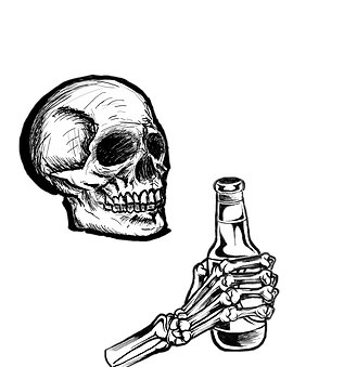
Top Center:
This one is supposed to be just skeletons having fun. A little flair with Salud is the usage of symbolism as family. Skulls often represent death, however, fun skeletons happen to celebrate the dead and make light of it. That is the goal here, to make the skeleton figures seem fun.
Top Right:
This is a topographical map of mount hood. A lot of the design flow of the site will either be geometric or have a topographical theme. The focus for patterns is lines and how they flow with one another. It has a second purpose of being relatively outdoorsy. That is not necessarily descriptive of Salud, but it falls in the realm of things the brand stands for.


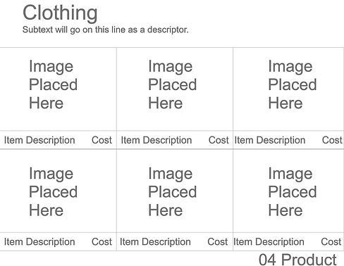
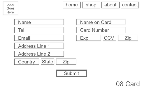
Initial Mockups.


Disclaimer:
Due to the request of the brand owner, certain assets have been omitted from the usability study and the web section of this project.
For Mockups, most imagery has been changed to some of my photography, drawings, and stock imagery I had on hand to accommodate for the empty space. Functionality and layout remain the same as the original.


Usability Studies.
Similar Brands:
Thrasher
Vans
Santa Cruz
RIPNDIP
A.Lab
Lurking Class
Odd Future
Killer Acid
Tentree
Core Values:
Bold
Inviting
Warm
Friendly
Age Range:
Full 18-40
Target 21-35
User Data:
Sample Size: 15
Locale: Pac NW
Personas: 5
Methods Used:
Heuristic Evaluation
Pre-Questionnaire
Observational Testing
Post Questionnaire
Card Sorting
Purpose:
The research results are intended to give insight into whether the users complete assigned tasks efficiently with as minimal processing power as required. To better understand the site's users, a higher focus was placed on qualitative data rather than quantitative.
The only quantitative-specific data set is from card sorting. The intent of the sort is for the information architecture of grouping-like items.
Disclaimer:
Due to the request of the brand owner, certain assets have been omitted from both the usability study and the web section of this project.
For usability, raw data has been pulled.

_Page_1.png)


Concepts & Animations
These are all the additional assets created that didn't fall into the original scope, but were agreed upon in a separate contract between client and designer.
The images are of general site assets to include cursor, menu typography, navigation, and textures.
The second videos are of animations created for the menu page and the loading buffer.


Creative Brief
Storyboard

Where's the Damn Site?
Unfortunately, we can try our best and sometime external factors get the better of us.
At this time, the brand owner does not wish to have Salud published on any public platform and I intend to respect their wishes. The domain is currently inactive so I can't even hint at a direction to find it.
If you want to see some of my web experience though, my Dutch Bros project entails fancy teamwork, cunning redesigns, and a lot of coffee. More of a Dev kind of person you say? Feel free to check out my other project as well, Asian Wok Cuisine, which, like this project, was fully developed by me, mostly.